Thursday, December 4, 2008
Final post for the semester.
So here are some screen shots. I want to mention that I kept in mind some elements of design that we'd discussed over the semester in this class. I feel like the diagonal rule, and the rule of thirds, was appropriately applied in the animation. I tried to create tensions of motion and force. When the litle starfish man is being turned into putty and sucked into a hole, he creates this elastic tension from top corner to bottom corner. I like the idea that a fourth dimension, time, creates instances where you expect something to happen by virtue of the "camera angle"; in other words, our little hatched egg guy stands over to stage left, and this, in theory, creates some attention to stage right; what's going to happen over there? I have noticed that in horror films in particular, tension can really be created by the field of view, often times building to a climax. Now, there's no horror in my cartoon short, but I do feel like I did what I set out to do, and that was to activate and give depth to what, on the face of it, is a fairly flat stage. I think that the "wiggle-vision", slightly amateurish animation is the most endearing part of it. Now, I hope to become much more accurate over the next few attempts with this program, but I wasn't extremely worried about how slick it looked. I was pretty much letting my imagination run.
Sunday, November 30, 2008
Last blog...
Finally rounding the last bases... I have added more color, and decided to have some somewhat perplexing action going on. I wanted to continue with the egg theme. The character tips his hat, irritating the hat, which has now turned into a cane-eating monster. The monster bites and swallows his cane. As the hat eats the cane, the character's right arm extends into sort of a blob, which breaks off of the character's arm, and falls off onto the ground plane. When the piece hits the ground, it breaks through the ground, opening up a manhole of sorts. The hat jumps into the manhole, and soon the character becomes a piece of gum that gets sucked into the manhole as well. Then, the manhole morphs mysteriously into the egg. The egg rolls to stage left and then upstage and out of sight. I've been basically continuing with hours of the same kind of thing that I did before. The process has put my arm to sleep on a number of occasions. I can't wait to do another project like this in the near future. All I have left to do before tuesday is put some little finishing touches on it, and that's it!
Oh and another thing- the blogspot site isn't letting me upload my video right now! THis is
driving me nuts! Stay tuned...
Oh and another thing- the blogspot site isn't letting me upload my video right now! THis is
driving me nuts! Stay tuned...
Sunday, November 23, 2008
New to this animation is some coloring and shading. I added a bit of shadows, which entailed making totally separate layers to remain under the objects (arms, legs, clouds, eggs) to which the shadows add depth. I used the Bamboo tablet again of course, this time making sure to use pressure variation to determine the width of my lines. Though the line weight had to remain constant for much of the objects and characters in the animation so far, I felt that it was appropriate to have some variation in line thickness in the shadowing. I went through, frame-by-frame, and gave myself an idea of the amount of time that it takes to color and shade much of the video. It was interesting. I feel like I will have quite a bit of time this coming week to expand on my ideas for adding depth which I developed over the past week. I intend to have one more minute of animation in addition to the minute or so that this iteration of the animation depicts.
I should also mention a stylistic approach that I took, to keep my hands from wearing out or spiralling into carpal tunnel syndrome- going over the animation bit by bit, not doing all of the shading for each frame altogether, but going through 90 frames or so only hitting the shading on the left. Then going back over those frames afterward and shading the right-hand side. And then going over those frames and shading with a darker gray. And then going over those frames and erasing a bit. It kept my motions as consistent as possible.
I do wonder if animators apply this same approach at times. We will see!
See you next time,
-Marshall
Sunday, November 16, 2008
What I have so far.
So far, I have been making a relatively simple animation out of blue lines. I spelled out my name, animating the letters as the name was spelled out. The M, at one point, turns into a bird, which regurgitates a worm for the rest of my name, which becomes the final A, and then the last two L's are spelled out, sort of like little wings. Those flap a bit, and then the swoop on the H in my name turns into a ghost, and swallows up the whole name. The ghost transforms into a blobby little creature, which catches a mysterious egg which rolls by into his hand. Then the egg rolls away from the creature's hand (the creature has turned into a "P" and walks off stage right) and hatches. The creature that hatches from the egg quickly grows into a bigger creature, and a porkpie hat falls from te sky onto his head. Just as the hat hits his head, a can thrown from stage right lands in his right hand, which he twirls once.
I made this in FLASH 8. I should say that Flash 8 is a pretty daunting program, at least on the face of it. I was fairly intimidated, since I got this program- how did it work?? I had some friends who are fairly well versed in it, so I took advantage of that.
Basically, what I have done is to set up my interface to be as similar to a traditionaly analog setup- a flipbook. I make a separate layer for each element of the animation. Anyone familiar with movie editing computer programs such as iMovie, or audio editing programs such as GarageBand or Logic should have a fairly good idea of the intuitive process involved in creating a work of art according to a certain timeline. First, I set up my stage. I noted what size I wanted. I started off by making separate animations of separate letters start on separate layers. Layers, essentially, work in much the same fashion that layers work in Photoshop, or in Illustrator. Whatever is at the top layer usually overlays anything underneath it. Next, I did this: I decided how long the animation might be. I was guessing about 500 frames to begin with, so I clicked on the 500th frame, and went to INSERT>TIMELINE>FRAME. That set up a frame for me. Then, I inserted "KeyFrames" by MODIFY>TIMELINE>CONVERT TO KEYFRAMES. That sets up, virtually, a 500 (495 in my case)-page "flipbook" wherein I could advance through pages, slightly altering or building upon, progressively, each previous page. How did I see what I was doing when I got to the new page? Well, I selected something called "onion skins" in the prompt- it's one of the icons below the layer editor. That, essentially, makes each page, during editing, like tracing paper. You can edit how transparent the "tracing paper" is, as well. It's great. So I just did that, pretty much for 7 hours today, and came up with what you see of the video so far.
The video, or animation, will be a bit longer, and more involved, by the end of the semester. Expect me to win an oscar for it. An Oscar Mayer hotdog. Or expect me to eat lunch a lot while working on it.
The MOST IMPORTANT tool for me, when working on this, was the Bamboo tablet that I borrowed from the art dept. It was great.
Friday, October 17, 2008
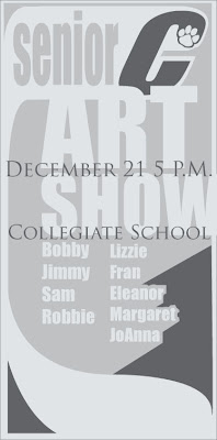
Fake Art Show
In order to draw more attention to the ad, I felt like it was important to make the eye move a bit differently than it does on the rest of the page. Of course, when the eye is reading the body copy in a newspaper, it goes from left to right and then down, and repeats. It generally gazes at the bold or larger headings and sub-headings first. Then, it moves on into the smaller copy and continues its routine. Now, ideally, an ad with a simple logo like the Collegiate C that I have designed, will, if that "C" gets enough public exposure, be immediately recognized. And, rightfully so- I think that it reads much more boldly than their Collegiate School logo that they have spelled out. So, if that "C" can direct a reader to the ad that we have, 3 columns wide and ten and a half inches tall, then the reader can go from there. Ideally, the reader could go down the list, and then, when their eye gets to the bottom, they follow this virtual "ribbon", coming from the "C", back up to the top, at which point their eye might more aptly move to the date and location of the art show. I am wondering if this aptly translates visually here. It's an idea.
I don't know- I am also pretty interested in the idea of running these logo ideas by my old art teacher- I have the luxury of a pretty well-supported and enthusiastic art program at my old high school. Shis won't necessarily end up being taken into serious consideration for an actual logo change at the school, BUT- I feel like it will be rewarding to actually talk to people in the program at the school about just why it is that they are in support of the current logo, or how they feel about it, etc. I have already run it by Mary, my high school art teacher.
Monday, October 13, 2008
Okay one more
This one looks like it's rolling, or moving more quickly-- forward. There wasn't an italic option for the font called IMPACT, which is where I got the C from in all of these permutations of the Cougar C... so I just took the C, at about 300 points large, and "expanded" it.... then sheared it 20 degreesto the right. Now, it's a speedier C. Plus the movement lines make it look more direct and aggressive. It, nonetheless, looks more modern and aggressive, dynamic, yet retains a bit of its classic iconography.
Option 6
option 5
Option 4
Option 3
I am toying with the idea of some very simple, very slight notions in the C of motion.
However, when I put these lines in, it made it look like the C could, conceivably-- be rolling to the left. Now, in terms of how we read this image, letters that progress- go to the right. At least in the English language. We read from left to right, and that's progress. SO, I think that maybe I should apply this stuff to the other pawed C... the one with the paw up on top of the C stroke. Then, maybe- it will look like it could be rolling forward- left to right. Let's see.
Option 2
This is another one. I am more interested in the alternate placement of the paw, at the top of the C stroke, as opposed to on the bottom, than I am in the background's olive color. But- I wanted to see what a contrast from the background, versus the colors of the C would do. I think that it could go either way. As simple as possible does the trick. So, I would like this image more if there wasn't that olive green background... I will stick to the classic green that's in the paw itself.
One option
Original Collegiate School generic Paw Print
This is the original paw-print logo that Collegiate School, the high school I went to, used on their sports jerseys. It's really monolithic, yet extremely generic; this paw-print icon has been used by countless sports teams from pee-wee soccer to high schools everywhere to colleges and professional teams. Being that the school aimed its teachings at, ostensibly, NOT being generic, I thought that there was a way to expand on this image. Essentially, I think, that what Collegiate intended to do with this logo, at least at the time, years and years ago when the icon was chosen, was not only represent the idea of the very aggressive and stealthy cougar as an animal, but also, they intended to show that Cougars, from Collegiate, are going to put their print, their mark, their "paw-print" on society. The irony is that so many other people chose this logo too- rendering it devoid, in this context, of any groundbreaking meaning as an image- it's rendered a platitude nowadays. It's a logo that just looks slapped on the helmets and jerseys. On the other hand, I felt like there would definitely be something missing if we just totally removed the paw print from the iconography. I thought, well, yeah-- the paw print has been used a million times, but it looks like all those other teams are doing the exact same thing with the paw print. Collegiate could show that, as a school, we can, metaphorically speaking, do MORE with the paws that we have been given. I thought- hey, why not add some movement to that paw, make it dynamic, but retain its basic properties? And it should be noted, also, that this paw print, the one that was omnipresent around school when I was going there over 10 years ago, now seems down-played. I didn't see the paw icon anywhere on the school's website main page. I think that there's a way that they could bring the image back.
Plus, the new connotation of the word "cougar" is a bit gawdy... thus, if any school needs to retain the image of the paw print, to show that we represent the spirit of the animal and not the divorcee'. I'm kidding around.
Tuesday, October 7, 2008
Vase.
I worked on the vase, straight fro the tutorial. I decided to go with a pretty thick stroke, I think about 20 or so pixels. I made the stroke itself a gray color. Then I went to the effects menu at the top, scrolled down to 3D, and chose "Revolve". It was interesting to see how it all worked... basically it takes your line and spins it in a circle to create what's in effect a virtual vase. I thought that it would be cool to create my own logo, so I made my initials and added that to the "symbols" menu. When creating the vase shape out of that one curved line, I selected the "map art" button and decided what symbol to put where. I chose my own, and put it on the outside face of the vase. Apparently this is easier to do if you have a thick stroke, since you can actually discern whether you are putting your symbol on the outside rather than the inside of the vase. And I noticed that a few people were having problems with the color of the vase... it's always going to be the color of the STROKE, rather than the color fill-in. Anyway. A vase...
I also applied the shading to the initials on the vase.
Wednesday, October 1, 2008
Re-worked Digital Self-Portrait
So, I went back and re-worked a few of the elements of my digital self-portrait. I had saved
this as a .psd before and was irritated to find out that once I saved it and wanted to get back to it on my computer... the layers had, for some reason, been eliminated. I made a mistake somewhere in there. I wanted to reduce the opacity of the glare in my glasses, but it was impossible to do this directly; I could have adjusted the color or saturation of those glare areas, but it wouldn't have made any difference-- my eyes would still be washed out. So I went in and took the background down a few notches. I think that helped a bit. Then i went in with the paintbrush at a low opacity and dealt with the white frosty little areas on the outskirts of my beard and head where I had pasted the head from a white original background that I'd been using initially. I think it came out okay.
Monday, September 29, 2008
Digital Self-portrait due 9/30
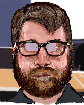
Above is the example of my portrait where I got it right. I didn't directly put any necessarily obvious visual symbols per se', but rather, feel like I wanted to sort of do my rendition of a portrait as my favorite portrait painter, Chuck Close, would have done it, if he were to use a computer and still had manual dexterity. I wanted to see if it was possible for me, at my skill level, to capture all of the tiredness that I was feeling in my face. I sort of made a half-smile-half-smirk. Chuck Close is 100% about process, and subscribed to a philosophy of "inspiration is for amateurs, the rest of us just show up and get to work". Of course I absolutely feel like my work is amateur and tiny in comparison to his, but what I hoped to convey was the emotion in my face; I made sure though to not pose too much for my Apple PhotoBooth photo, so as to sit in and let my natural sitting face do the talking. I understand that this stood a chance at failing to convey the essence of, "me", but given my relative skill level versus my skill level as a real painter, I felt like it was a cool challenge, after watching so many YouTube videos about Chuck Close and then about attempts at painting faces on a computer with a Wacom Bamboo tablet. Interestingly, I felt like to get a bit to the left of being photorealistic; in getting almost a complex cartoony, that a photoshop approach would be better suited, if I was going to try to replicate the feel of the style. I hope that this makes sense.
I went through a similar process of painting/drawing with colored pencils to the process that I would use in real life-- I get the frame of the face all structured out, and then put in the eyes and the shape of the hair and beard. From there, I essentially followed a similar process that you might see painters use on youtube videos like "speed painting". I used the color eye-dropper to get colors matched as accurately as possible. It was a lot of fun. I used, generally, a 100% level of "hardness". I used about 5 colors or varying hues on the hair and the beard, and the same went for the face. I would use a larger diameter brush for painting in the facial skin colors, and then vary colors until they built up really well. It was a bit awkward trying to be accurate with the tablet, still. I feel like I want to get an Intuos 3. That's a higher-end one, with more levels of pressure variation. That was a big part of shaping my lines. Then I went in and took care of the reflection on my glasses. I did that with the regular lasso tool and put the paint bucket to work, in a low opacity light purple. The layer underneath was my background. I drew up a rendition of the background in my PhotoBooth photo, then selected that layer, and ran it through a gaussian blur. I thought that it took care of the focal point very well.
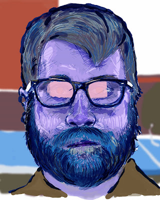
Second, is the example of putting my .jpeg up on the web without saving it in RGB mode first. You can see that there was a lot of color information lost in the web's own "translation" from a CMYK file to web. It got almost all of the colors wrong.
Tuesday, September 23, 2008
Pencil-to-Photoshop self portrait.
My self-portrait done from the pencil drawing I brought into class today. I manipulated the colors and such, using the Bamboo tablet. At times the tablet was almost like using an airbrush. With the dissolve mode selected in my layers, colors hit the pencil drawing in a way similar to when I have colored pencil drawings with watercolor or inkwash. It's really interesting getting in touch with this process.
Strange; looks like some sort of FBI composite image that they would put up at the post office. I have successfully creeped myself out. Neat!
Tablet Ball
Monday, September 15, 2008
Part 4 of "Photo Essay"
This is a play similar to the dog on the stairs; here we have a whole lot of story happening in the foreground, but the dog isn't necessarily the focal point. It's the angry, live crab that the dog has adopted as a chew toy (sorry). The dog didn't get hurt at all. Very scary trying to get anything out of this dog's mouth. The crab didn't stand a chance. I thought that since this dog was almost a gun-metal gray, and the deck really camouflaged with the dog, then it would
be fun to take the understated background and modify it, through the hue/saturation selection, and have any background color relate to the tongue and mouth of the dog. It still looks a bit off, but the color play was nice, and yielded, as I'd intended, to the cringe-worthy action going on here.
Part 3 of "Photo Essay"
There obviously isn't a lot of motion going on in this picture, but it has what I consider to be a pretty dramatic play of foreground to background, especially accentuated by the broom making a play on the vanishing point. SO, I used a gaussian blur to calm down some of those elements and shed more emphasis on Bean's face.
Part 2 of "Photo Essay"
I took an image, which I liked, with a diagonal composition, and used the lasso tool to select the dog, Titan, and his owner. I then inversed my selection and filtered the background with a motion blur. In my opinion it made that tension between the dog and the owner greater, the motion was strengthened.
A "Photo Essay"
It occurred to me that I enjoy taking pictures of dogs.
I can only really analyze that in retrospect, so now that
I think about it, I imagine that it must be that dogs, to
me, are a very honest and non-posing living subject for
photography. They are usually a lot more facially
expressive than other animals. Unlike where people
pose for the viewers of the photos, the dog, if it poses,
or plays, plays or poses to you, the photographer.
It's an ignorance of process that makes a dog an honest
subject. I have some photos of some of my best friends'
dogs. I tried to make sure, where possible, to mute
the background, or at least the areas furthest away
from the most important action of the dogs.
Here, I took the following original photo of two dogs, Bean and Raisin, as Bean attacked my foot because I was egging her on.
I took that image, and felt that I should add a blurring action to make all of the background(that other than my foot and Bean). I used the polygonal lasso to select my leg and foot first. Then I inversed my selection and added a motion blur to everything but that. Then I selected my leg and bean, the dog in front. I inversed that selection, and added a motion blur that was perpendicular to the rest of the motion blur. In doing this, I accented the foreground, and left the background to do nothing but accent the motion between the dog and my foot.
Tuesday, September 9, 2008
FILES!
"There are reasons for each of these types of file to exist. If there were not, then there would be no arbitrary new file types propping up here and there."
-Perez
.TIFF: A file format that does not lose information when saved. Saves layers, paths, and all graphic data. This is usually a large file.
-If you use image compression on a TIFF, you are not going to lose any information. There is a difference in the "byte order" of an IBM PC and a Macintosh.
.JPEG: An image file which loses information by compressing graphic information. It's difference on the screen is not noticeable; when printed out though, there is a noticeable different. The difference between a file like a .TIFF and a .JPEG is similar to the difference
between a .WAV and a .MP3. There, to the less-trained eye or ear, is essentially no noticeable
difference.
.PNG: does not lose information. Does not save layers. Compresses to smaller file than TIFF.
.GIF: Like a jpeg. Loses information by compressing. Can't save layers. Saves as INDEXED COLOR file not RGB or CMYK. Browsers can see .GIFs.
Friday, September 5, 2008
James. In RGB!
Red, Green, and Blue... as seen on television!
Here, I had an original photo which I had taken of James. I believe that I originially took the photograph in color. I switched the photo layer over to grayscale and then added a new layer, and did some coloring over certain parts of the photo by using the polygonal lasso and then filling in my selections with the colors red, green, and blue. I set the opacity for my paintbrush, if I remember correctly, at somewhere around 3o to 35 percent.
The mode I put the layer in was either multiply or dissolve. I kept on forgetting that when I was setting the layer to dissolve or multiply, that this wasn't actually changing my brush, but just the layer itself. I don't think that I would have that problem if I tried something like this again.
Thursday, September 4, 2008
Thur-Man: The hero.
BACKSTORY
I may have named Thur-Man incorrectly; I can't remember what James, Donna, and I decided altogether to name him.
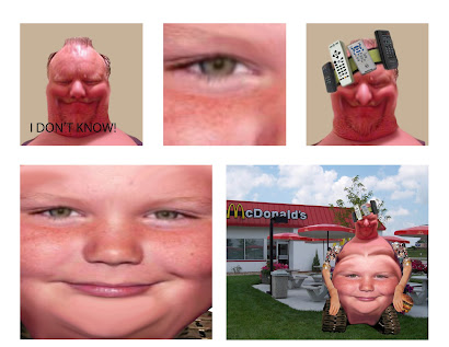
He essentially is an American champion of convenience. He eschews exercise, critical thinking, reading, and rolling over to the television, preferring to use his custom headset to interact with his preferred mode of entertainment.
But he is not the whole being. Thur-man is only half of the picture. Thur-man is the outward beast, derided by his inner infant; a creature of sloth, and from time to time, very low-level wrath. If strong irritability could be classified as wrath. The inner infant is Thurman, the face on his belly who controls him like a pawn, enslaving him to his every whim, controlling his blood sugar and contorting what's left of his spine into a scoliotic nightmare like a telekinetic would bend a spoon. The man who's head sits atop this pile of flesh was given the name Ron L. Hubdonald as a child. He once lived a blissfully mediocre lifestyle, working at a Zenith television factory, before gamma rays possessed his mind and drove him to construct the super-zero you see before you; part man-boy, part time-saving widget of convenience. Thur-man represents, as a super-zero, the absolute inverse of the apex of human evolution. He is a pizzone revolution. I like to think of this project as a silly little
fun poke at the overly-technological establishment. I like to think that Thur-man
will belch their techno-silico-status-quo back in their faces.
CONCEPTION TO REALIZATION
We looked up "Beer Belly", "Thurman Murman", and "Tank Wheelchair" on images.google.com, and then paired these images all together by clicking "place"
from the menu. We would put those images together, and crop them as if cutting
them deftly from a magazine, using Photoshop's "magnetic lasso". Then, if need be,
I went in and used the eraser to clean up the edges to get them a bit smoother looking.
Then, we took the prosthetic arm image from google as well. Lassoed that with
the polygonal lasso tool. Once we had it on it's own layer, we copied and pasted it, and
then free-transformed it until we had a mirror image of it, which we could use as
an arm on either side. There wasn't too much mystery in this whole process. I felt
like we all had the process down pat. I suggested that we smudge the boy's face into
the beer-gut of the man, and thus the humanoid-mutant-robo-slob was born, to answer
to complete and absolute impulsiveness.
Thursday, August 28, 2008
Tuesday, August 26, 2008
Shortcuts/preferences on a Mac.
I know of couple of simple time-savers that are, in my opinion,
sanity-saving when working on anything from a paper
to an Adobe application on my Mac.
I am no expert, but have been given some great advice
from friends that actually make their incomes on their
Macs.
One really good time-saver is to click on the apple in
the top left-hand corner of your screen and then click
on system preferences once the apple menu opens.
Depending on what version of the operating system you
use, there should be an icon that either should be
marked Dashboard and Expose' or something like
Spaces and Expose'. I could be remembering that
last one wrong, as I don't have the latest version of OSX.
Anyways, my friend Roy Wilhelm, who I believe now
works for Richmond Magazine, told me about Expose',
and I have used this preference ever since. This has been
for about 3 years now, and I feel like once you get used
to it, you will find it to be very helpful in navigating
what could stand to be many windows open at a time if
you are working on, for instance, a Photoshop project
where you will have to navigate between two or three different
windows over and over. I find Expose' very helpful since I hate
the tedium of clicking on the top bar of the window in
the front, moving it out of the way, and then searching
for the needed window under what could be four or five
OTHER open windows, especially if you also have other
applications open such as iTunes or a web browser. I think
it is safe to assume that most of you reading this have
had to do this at one point or another. I, for one, feel
frustrated and disorganized when I feel like I am sifting
through a disorganized virtual stack of paper on my
screen.
SO. Go to system preferences, like I was saying, click on
Dashboard/Expose', and you should see a menu with a
"screen" in the middle, and four triangle-arrows pointing
to the four corners of the screen. The top of the menu
should say "Active Corners". I like to use the top left
and right as active corners. In the past, I think they have
been called "Hot Corners", or something like that. There
should be little click-and-drag icons that you can use to change
your corners into organizing tools. I personally like to
use the top left corner of my screen to be an active corner
to display All Windows, and the upper right of my screen
to be an active corner to display the Desktop; i.e. scoot
all of the open windows out of the way so that I can
see what's underneath, get to a folder that is unopened
on my desktop, or access my Dashboard more easily.
Once I have customized my Active Corners, I can move
my cursor ALL THE WAY into the top-left corner
so that I can see shrunken, click-on-able versions
of all of my open windows on the screen side by side at
once, so that I can see immediately access the window
that I need, rather than sifting around for it. Alternately,
I can drag my cursor all the way into the top-right corner
so that I can move everything out of the way and get to
a folder on my desktop or to my dashboard, unfettered
by open windows.
It should also be noted that if you accidentally
drag your cursor to one of those corners, you can just
move it to that corner once again to quickly go back to
whatever you were doing.
OR: if you prefer to have a single key do all of this for
you, for instance have F9 move all of your windows
to the front or F10 temporarily clear windows from
your desktop, you can customize that in the Expose'
system preferences as well. Whichever you prefer,
this will definitely save you some time and grant
you more control over your workspace. Allow
yourself some time to get used to it, too; I don't think
that you will regret it.
Another thing that I have been trying to be savvy about
lately is remembering keyboard shortcuts. There are
keyboard shortcuts for the majority of the programs that
you will use on a Mac (and for that matter, a PC). As you
go through your usual routine running programs and
doing projects on your Mac, try and commit to memory,
and use some of the keyboard shortcuts. For instance, in Illustrator,
I like to hold down the Apple key and then press + or - to
zoom in or out. If you are viewing this blog on Firefox, look
click on FILE on the menu bar, and drag down. Notice the
keyboard shortcuts listed to the right of where it says SAVE,
NEW TAB, OPEN FILE, and other options? Try commiting
just a few of those shortcuts to memory and keep track of
how much time you save.
Today
I enjoyed dusting off my beginner skills in Photoshop today.
I learned some more succinct approaches to putting together
what, on the face of it, was a silly Hulk-griffon-appotamus....
but in reality the process, I suspect, could stand to be a very
good supporting beam to much of what happens when editing
compositions in this program. I think also that since the image
was so silly, that was a good exercise in helping the processI learned some more succinct approaches to putting together
what, on the face of it, was a silly Hulk-griffon-appotamus....
but in reality the process, I suspect, could stand to be a very
good supporting beam to much of what happens when editing
compositions in this program. I think also that since the image
remain fresh in our minds. Being that our intended professions
are all going to be in the teaching sphere, I was glad to see that
Donna and James to my left and right were both comfortable in
asking for advice and in giving it. I think that this made the
process move ahead very smoothly. It kept me from getting too
hyper- or hypo-focused too. Communication is good.
I had not thought before to adjust the tolerance levels in the
top menu bar before using the magnetic lasso. To be honest,
I had resigned myself to the assumption that the magnetic
lasso was not very far-reaching in its applicability.
I am glad that I was wrong!
Subscribe to:
Posts (Atom)