Thursday, December 4, 2008

Final post for the semester.


So here are some screen shots. I want to mention that I kept in mind some elements of design that we'd discussed over the semester in this class. I feel like the diagonal rule, and the rule of thirds, was appropriately applied in the animation. I tried to create tensions of motion and force. When the litle starfish man is being turned into putty and sucked into a hole, he creates this elastic tension from top corner to bottom corner. I like the idea that a fourth dimension, time, creates instances where you expect something to happen by virtue of the "camera angle"; in other words, our little hatched egg guy stands over to stage left, and this, in theory, creates some attention to stage right; what's going to happen over there? I have noticed that in horror films in particular, tension can really be created by the field of view, often times building to a climax. Now, there's no horror in my cartoon short, but I do feel like I did what I set out to do, and that was to activate and give depth to what, on the face of it, is a fairly flat stage. I think that the "wiggle-vision", slightly amateurish animation is the most endearing part of it. Now, I hope to become much more accurate over the next few attempts with this program, but I wasn't extremely worried about how slick it looked. I was pretty much letting my imagination run.

Sunday, November 30, 2008

Last blog...

Finally rounding the last bases... I have added more color, and decided to have some somewhat perplexing action going on. I wanted to continue with the egg theme. The character tips his hat, irritating the hat, which has now turned into a cane-eating monster. The monster bites and swallows his cane. As the hat eats the cane, the character's right arm extends into sort of a blob, which breaks off of the character's arm, and falls off onto the ground plane. When the piece hits the ground, it breaks through the ground, opening up a manhole of sorts. The hat jumps into the manhole, and soon the character becomes a piece of gum that gets sucked into the manhole as well. Then, the manhole morphs mysteriously into the egg. The egg rolls to stage left and then upstage and out of sight. I've been basically continuing with hours of the same kind of thing that I did before. The process has put my arm to sleep on a number of occasions. I can't wait to do another project like this in the near future. All I have left to do before tuesday is put some little finishing touches on it, and that's it!

Oh and another thing- the blogspot site isn't letting me upload my video right now! THis is
driving me nuts! Stay tuned...

Sunday, November 23, 2008


New to this animation is some coloring and shading. I added a bit of shadows, which entailed making totally separate layers to remain under the objects (arms, legs, clouds, eggs) to which the shadows add depth. I used the Bamboo tablet again of course, this time making sure to use pressure variation to determine the width of my lines. Though the line weight had to remain constant for much of the objects and characters in the animation so far, I felt that it was appropriate to have some variation in line thickness in the shadowing. I went through, frame-by-frame, and gave myself an idea of the amount of time that it takes to color and shade much of the video. It was interesting. I feel like I will have quite a bit of time this coming week to expand on my ideas for adding depth which I developed over the past week. I intend to have one more minute of animation in addition to the minute or so that this iteration of the animation depicts.
I should also mention a stylistic approach that I took, to keep my hands from wearing out or spiralling into carpal tunnel syndrome- going over the animation bit by bit, not doing all of the shading for each frame altogether, but going through 90 frames or so only hitting the shading on the left. Then going back over those frames afterward and shading the right-hand side. And then going over those frames and shading with a darker gray. And then going over those frames and erasing a bit. It kept my motions as consistent as possible.
I do wonder if animators apply this same approach at times. We will see!
See you next time,
-Marshall

Sunday, November 16, 2008

What I have so far.

So far, I have been making a relatively simple animation out of blue lines. I spelled out my name, animating the letters as the name was spelled out. The M, at one point, turns into a bird, which regurgitates a worm for the rest of my name, which becomes the final A, and then the last two L's are spelled out, sort of like little wings. Those flap a bit, and then the swoop on the H in my name turns into a ghost, and swallows up the whole name. The ghost transforms into a blobby little creature, which catches a mysterious egg which rolls by into his hand. Then the egg rolls away from the creature's hand (the creature has turned into a "P" and walks off stage right) and hatches. The creature that hatches from the egg quickly grows into a bigger creature, and a porkpie hat falls from te sky onto his head. Just as the hat hits his head, a can thrown from stage right lands in his right hand, which he twirls once.

I made this in FLASH 8. I should say that Flash 8 is a pretty daunting program, at least on the face of it. I was fairly intimidated, since I got this program- how did it work?? I had some friends who are fairly well versed in it, so I took advantage of that.
Basically, what I have done is to set up my interface to be as similar to a traditionaly analog setup- a flipbook. I make a separate layer for each element of the animation. Anyone familiar with movie editing computer programs such as iMovie, or audio editing programs such as GarageBand or Logic should have a fairly good idea of the intuitive process involved in creating a work of art according to a certain timeline. First, I set up my stage. I noted what size I wanted. I started off by making separate animations of separate letters start on separate layers. Layers, essentially, work in much the same fashion that layers work in Photoshop, or in Illustrator. Whatever is at the top layer usually overlays anything underneath it. Next, I did this: I decided how long the animation might be. I was guessing about 500 frames to begin with, so I clicked on the 500th frame, and went to INSERT>TIMELINE>FRAME. That set up a frame for me. Then, I inserted "KeyFrames" by MODIFY>TIMELINE>CONVERT TO KEYFRAMES. That sets up, virtually, a 500 (495 in my case)-page "flipbook" wherein I could advance through pages, slightly altering or building upon, progressively, each previous page. How did I see what I was doing when I got to the new page? Well, I selected something called "onion skins" in the prompt- it's one of the icons below the layer editor. That, essentially, makes each page, during editing, like tracing paper. You can edit how transparent the "tracing paper" is, as well. It's great. So I just did that, pretty much for 7 hours today, and came up with what you see of the video so far.
The video, or animation, will be a bit longer, and more involved, by the end of the semester. Expect me to win an oscar for it. An Oscar Mayer hotdog. Or expect me to eat lunch a lot while working on it.
The MOST IMPORTANT tool for me, when working on this, was the Bamboo tablet that I borrowed from the art dept. It was great.

Friday, October 17, 2008

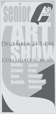
Fake Art Show


In order to draw more attention to the ad, I felt like it was important to make the eye move a bit differently than it does on the rest of the page. Of course, when the eye is reading the body copy in a newspaper, it goes from left to right and then down, and repeats. It generally gazes at the bold or larger headings and sub-headings first. Then, it moves on into the smaller copy and continues its routine. Now, ideally, an ad with a simple logo like the Collegiate C that I have designed, will, if that "C" gets enough public exposure, be immediately recognized. And, rightfully so- I think that it reads much more boldly than their Collegiate School logo that they have spelled out. So, if that "C" can direct a reader to the ad that we have, 3 columns wide and ten and a half inches tall, then the reader can go from there. Ideally, the reader could go down the list, and then, when their eye gets to the bottom, they follow this virtual "ribbon", coming from the "C", back up to the top, at which point their eye might more aptly move to the date and location of the art show. I am wondering if this aptly translates visually here. It's an idea.
I don't know- I am also pretty interested in the idea of running these logo ideas by my old art teacher- I have the luxury of a pretty well-supported and enthusiastic art program at my old high school. Shis won't necessarily end up being taken into serious consideration for an actual logo change at the school, BUT- I feel like it will be rewarding to actually talk to people in the program at the school about just why it is that they are in support of the current logo, or how they feel about it, etc. I have already run it by Mary, my high school art teacher.

Monday, October 13, 2008

Okay one more

This one looks like it's rolling, or moving more quickly-- forward. There wasn't an italic option for the font called IMPACT, which is where I got the C from in all of these permutations of the Cougar C... so I just took the C, at about 300 points large, and "expanded" it.... then sheared it 20 degreesto the right. Now, it's a speedier C. Plus the movement lines make it look more direct and aggressive. It, nonetheless, looks more modern and aggressive, dynamic, yet retains a bit of its classic iconography.

Option 6

So there's the high-lighting path made lighter. I don't know. There's something not too graceful about the way this highlight operates within the C. I think that I would just go with option number 4. It really works best, in my opinion.