Monday, September 29, 2008

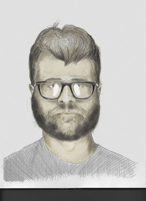
Digital Self-portrait due 9/30

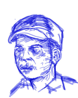
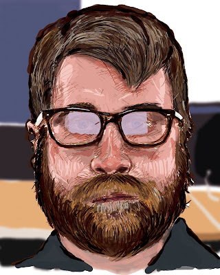
Above is the example of my portrait where I got it right. I didn't directly put any necessarily obvious visual symbols per se', but rather, feel like I wanted to sort of do my rendition of a portrait as my favorite portrait painter, Chuck Close, would have done it, if he were to use a computer and still had manual dexterity. I wanted to see if it was possible for me, at my skill level, to capture all of the tiredness that I was feeling in my face. I sort of made a half-smile-half-smirk. Chuck Close is 100% about process, and subscribed to a philosophy of "inspiration is for amateurs, the rest of us just show up and get to work". Of course I absolutely feel like my work is amateur and tiny in comparison to his, but what I hoped to convey was the emotion in my face; I made sure though to not pose too much for my Apple PhotoBooth photo, so as to sit in and let my natural sitting face do the talking. I understand that this stood a chance at failing to convey the essence of, "me", but given my relative skill level versus my skill level as a real painter, I felt like it was a cool challenge, after watching so many YouTube videos about Chuck Close and then about attempts at painting faces on a computer with a Wacom Bamboo tablet. Interestingly, I felt like to get a bit to the left of being photorealistic; in getting almost a complex cartoony, that a photoshop approach would be better suited, if I was going to try to replicate the feel of the style. I hope that this makes sense.
I went through a similar process of painting/drawing with colored pencils to the process that I would use in real life-- I get the frame of the face all structured out, and then put in the eyes and the shape of the hair and beard. From there, I essentially followed a similar process that you might see painters use on youtube videos like "speed painting". I used the color eye-dropper to get colors matched as accurately as possible. It was a lot of fun. I used, generally, a 100% level of "hardness". I used about 5 colors or varying hues on the hair and the beard, and the same went for the face. I would use a larger diameter brush for painting in the facial skin colors, and then vary colors until they built up really well. It was a bit awkward trying to be accurate with the tablet, still. I feel like I want to get an Intuos 3. That's a higher-end one, with more levels of pressure variation. That was a big part of shaping my lines. Then I went in and took care of the reflection on my glasses. I did that with the regular lasso tool and put the paint bucket to work, in a low opacity light purple. The layer underneath was my background. I drew up a rendition of the background in my PhotoBooth photo, then selected that layer, and ran it through a gaussian blur. I thought that it took care of the focal point very well.
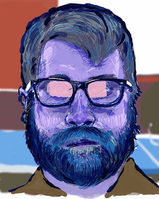


Second, is the example of putting my .jpeg up on the web without saving it in RGB mode first. You can see that there was a lot of color information lost in the web's own "translation" from a CMYK file to web. It got almost all of the colors wrong.
Tuesday, September 23, 2008

Pencil-to-Photoshop self portrait.

My self-portrait done from the pencil drawing I brought into class today. I manipulated the colors and such, using the Bamboo tablet. At times the tablet was almost like using an airbrush. With the dissolve mode selected in my layers, colors hit the pencil drawing in a way similar to when I have colored pencil drawings with watercolor or inkwash. It's really interesting getting in touch with this process.
Strange; looks like some sort of FBI composite image that they would put up at the post office. I have successfully creeped myself out. Neat!

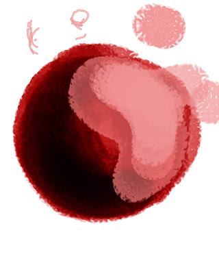
Tablet Ball

My attempt at the sphere that we were to render with the tablet. Could mess with the ideas a little bit more... beginning to understand it.

James: a Bamboo portrait.

Monday, September 15, 2008

Part 4 of "Photo Essay"


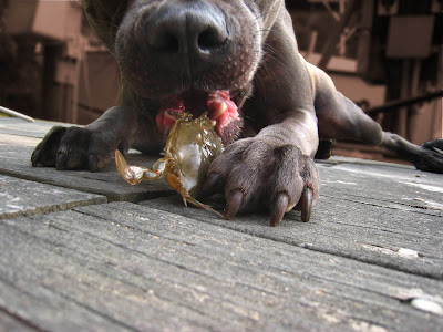
This is a play similar to the dog on the stairs; here we have a whole lot of story happening in the foreground, but the dog isn't necessarily the focal point. It's the angry, live crab that the dog has adopted as a chew toy (sorry). The dog didn't get hurt at all. Very scary trying to get anything out of this dog's mouth. The crab didn't stand a chance. I thought that since this dog was almost a gun-metal gray, and the deck really camouflaged with the dog, then it would
be fun to take the understated background and modify it, through the hue/saturation selection, and have any background color relate to the tongue and mouth of the dog. It still looks a bit off, but the color play was nice, and yielded, as I'd intended, to the cringe-worthy action going on here.

Part 3 of "Photo Essay"


There obviously isn't a lot of motion going on in this picture, but it has what I consider to be a pretty dramatic play of foreground to background, especially accentuated by the broom making a play on the vanishing point. SO, I used a gaussian blur to calm down some of those elements and shed more emphasis on Bean's face.

Part 2 of "Photo Essay"


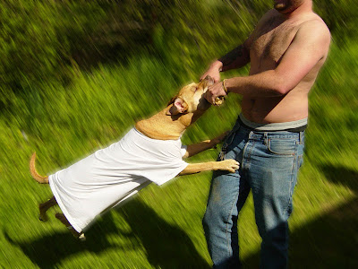
I took an image, which I liked, with a diagonal composition, and used the lasso tool to select the dog, Titan, and his owner. I then inversed my selection and filtered the background with a motion blur. In my opinion it made that tension between the dog and the owner greater, the motion was strengthened.

A "Photo Essay"


It occurred to me that I enjoy taking pictures of dogs.
I can only really analyze that in retrospect, so now that
I think about it, I imagine that it must be that dogs, to
me, are a very honest and non-posing living subject for
photography. They are usually a lot more facially
expressive than other animals. Unlike where people
pose for the viewers of the photos, the dog, if it poses,
or plays, plays or poses to you, the photographer.
It's an ignorance of process that makes a dog an honest
subject. I have some photos of some of my best friends'
dogs. I tried to make sure, where possible, to mute
the background, or at least the areas furthest away
from the most important action of the dogs.

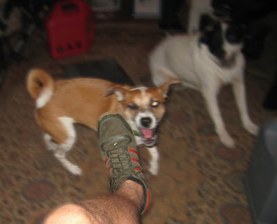
Here, I took the following original photo of two dogs, Bean and Raisin, as Bean attacked my foot because I was egging her on.


I took that image, and felt that I should add a blurring action to make all of the background(that other than my foot and Bean). I used the polygonal lasso to select my leg and foot first. Then I inversed my selection and added a motion blur to everything but that. Then I selected my leg and bean, the dog in front. I inversed that selection, and added a motion blur that was perpendicular to the rest of the motion blur. In doing this, I accented the foreground, and left the background to do nothing but accent the motion between the dog and my foot.

Tuesday, September 9, 2008

FILES!

"There are reasons for each of these types of file to exist. If there were not, then there would be no arbitrary new file types propping up here and there."
-Perez

.TIFF
: A file format that does not lose information when saved. Saves layers, paths, and all graphic data. This is usually a large file.
-If you use image compression on a TIFF, you are not going to lose any information. There is a difference in the "byte order" of an IBM PC and a Macintosh.

.JPEG: An image file which loses information by compressing graphic information. It's difference on the screen is not noticeable; when printed out though, there is a noticeable different. The difference between a file like a .TIFF and a .JPEG is similar to the difference
between a .WAV and a .MP3. There, to the less-trained eye or ear, is essentially no noticeable
difference.

.PNG: does not lose information. Does not save layers. Compresses to smaller file than TIFF.

.GIF: Like a jpeg. Loses information by compressing. Can't save layers. Saves as INDEXED COLOR file not RGB or CMYK. Browsers can see .GIFs.

Friday, September 5, 2008

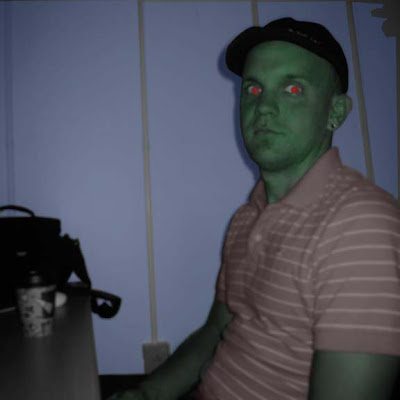
James. In RGB!

Red, Green, and Blue... as seen on television!
Here, I had an original photo which I had taken of James. I believe that I originially took the photograph in color. I switched the photo layer over to grayscale and then added a new layer, and did some coloring over certain parts of the photo by using the polygonal lasso and then filling in my selections with the colors red, green, and blue. I set the opacity for my paintbrush, if I remember correctly, at somewhere around 3o to 35 percent.
The mode I put the layer in was either multiply or dissolve. I kept on forgetting that when I was setting the layer to dissolve or multiply, that this wasn't actually changing my brush, but just the layer itself. I don't think that I would have that problem if I tried something like this again.

Thursday, September 4, 2008

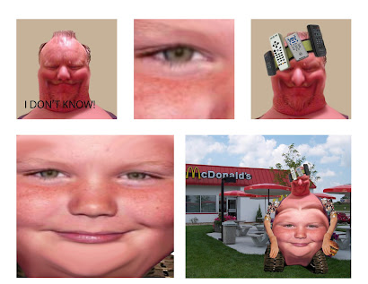
Thur-Man: The hero.

BACKSTORY
I may have named Thur-Man incorrectly; I can't remember what James, Donna, and I decided altogether to name him.
He essentially is an American champion of convenience. He eschews exercise, critical thinking, reading, and rolling over to the television, preferring to use his custom headset to interact with his preferred mode of entertainment.

But he is not the whole being. Thur-man is only half of the picture. Thur-man is the outward beast, derided by his inner infant; a creature of sloth, and from time to time, very low-level wrath. If strong irritability could be classified as wrath. The inner infant is Thurman, the face on his belly who controls him like a pawn, enslaving him to his every whim, controlling his blood sugar and contorting what's left of his spine into a scoliotic nightmare like a telekinetic would bend a spoon. The man who's head sits atop this pile of flesh was given the name Ron L. Hubdonald as a child. He once lived a blissfully mediocre lifestyle, working at a Zenith television factory, before gamma rays possessed his mind and drove him to construct the super-zero you see before you; part man-boy, part time-saving widget of convenience. Thur-man represents, as a super-zero, the absolute inverse of the apex of human evolution. He is a pizzone revolution. I like to think of this project as a silly little
fun poke at the overly-technological establishment. I like to think that Thur-man
will belch their techno-silico-status-quo back in their faces.

CONCEPTION TO REALIZATION
We looked up "Beer Belly", "Thurman Murman", and "Tank Wheelchair" on images.google.com, and then paired these images all together by clicking "place"
from the menu. We would put those images together, and crop them as if cutting
them deftly from a magazine, using Photoshop's "magnetic lasso". Then, if need be,
I went in and used the eraser to clean up the edges to get them a bit smoother looking.
Then, we took the prosthetic arm image from google as well. Lassoed that with
the polygonal lasso tool. Once we had it on it's own layer, we copied and pasted it, and
then free-transformed it until we had a mirror image of it, which we could use as
an arm on either side. There wasn't too much mystery in this whole process. I felt
like we all had the process down pat. I suggested that we smudge the boy's face into
the beer-gut of the man, and thus the humanoid-mutant-robo-slob was born, to answer
to complete and absolute impulsiveness.