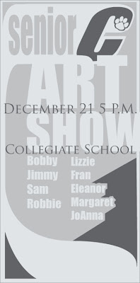
In order to draw more attention to the ad, I felt like it was important to make the eye move a bit differently than it does on the rest of the page. Of course, when the eye is reading the body copy in a newspaper, it goes from left to right and then down, and repeats. It generally gazes at the bold or larger headings and sub-headings first. Then, it moves on into the smaller copy and continues its routine. Now, ideally, an ad with a simple logo like the Collegiate C that I have designed, will, if that "C" gets enough public exposure, be immediately recognized. And, rightfully so- I think that it reads much more boldly than their Collegiate School logo that they have spelled out. So, if that "C" can direct a reader to the ad that we have, 3 columns wide and ten and a half inches tall, then the reader can go from there. Ideally, the reader could go down the list, and then, when their eye gets to the bottom, they follow this virtual "ribbon", coming from the "C", back up to the top, at which point their eye might more aptly move to the date and location of the art show. I am wondering if this aptly translates visually here. It's an idea.
I don't know- I am also pretty interested in the idea of running these logo ideas by my old art teacher- I have the luxury of a pretty well-supported and enthusiastic art program at my old high school. Shis won't necessarily end up being taken into serious consideration for an actual logo change at the school, BUT- I feel like it will be rewarding to actually talk to people in the program at the school about just why it is that they are in support of the current logo, or how they feel about it, etc. I have already run it by Mary, my high school art teacher.

1 comment:
looks really good, i like the small text coming forward. well done!
Post a Comment